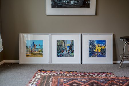
Did you know that of our five senses, in terms of memory, that sight is our worst? Smell is our best. Something I learned in college when I read Josef Albers’ Interaction of Color. He states that if we take a color we all are familiar with, like Coke a Cola red and lay out a bunch of red samples and ask 10 people to pic Coke Red, you would get 10 different answers and probably none of them correct. Our visual memory isn’t that great. My approach to color has always been color pleasing, not color matching. Though I must say that mostly I push color to please me. I tend to get push back at times, when people think I have gone too far and the color is weird. I envy painters who can paint the sky pink and it’s cool. But heaven forbit I do that. I am often asked to see the original. Recently a guy wanted one of my iPhone pics to make a little desk top print to pin to his wall. He’s musician and said the image (he saw it on Instagram) made him feel good. I don’t normally give out files to folks who want to make their own prints, but in this case, the version he wanted was not the final, so I considered an out take. A nice out take, but not then final. So I passed it on to him. But then he said he wished to “correct” and could he get a copy of the original. I ignored him as his request offended me. It’s like, can I have one of your songs? I want to change the lyrics, and correct it. Sheeess…and he is supposed to be an artist too. I guess my point is that photographers not often allowed to be interpretive like other artists are. Invariably the question come up, did you photoshop that? Ok end of rant…
The real point is that color is personal, and our memories of a place and what it looked like and what the color looked like are very much tied to our other senses. Our visual memories are fuzzy, so we can never get the exact color in a photograph. I never tried. I never cared to make a photograph that replicated what I saw. I wanted to make an imaged that captured what I felt.

