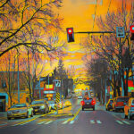
Or make it red, or reverse it out or some combination of all 4. Ever hear those rules for good design? Or good art in general? I actually have a poster from a UW design professor that incorporates all 4 of these properties. I even once heard that National Geographic Magazine encouraged their photogs to have red in their pictures. I know I am big on the use of red in mine. And then I see this.
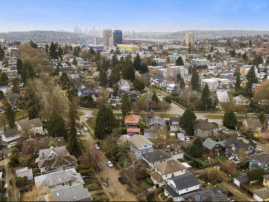
A drone real estate photo. A house around the corner from me is up for sale and this image shows my neighborhood. It is very cool actually. I have quite seen my neighborhood so illustrated. But tell me, when you look at this photo, where does your eye come to rest? The red roof perhaps? My house, with my little studio right behind it. Those first tall buildings and the land to the immediate left of them is the University of Washington. In the distance is the Emerald City, about 5 miles away. Lake Union can be seen as well. South Lake Union area is Amazon Land. Not a bad photoshop job either, with the fake blue sky and all.
Ever thought of doing drone work? Not me. I already got my hands full with stuff. One of the reasons I left real estate work is I didn’t want to take up video and drone work. Drone stuff looks fun, but I would want to fuss with all the rules and FAA regulations. Besides I find them annoying when I hear them buzzing overhead somewhere. I look around to see if I can find the operator so I can go punch his lights out for invading my space. But more and more I am seeing these images. Guess I should stop looking at Zillow so much. But for some reason, this image intrigues me. I seem to think it is about my house and not the one that is actually for sale.
m

